Visual Integrated Marketing Campaign for MasteryPrep

Company Analysis

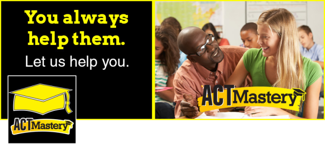
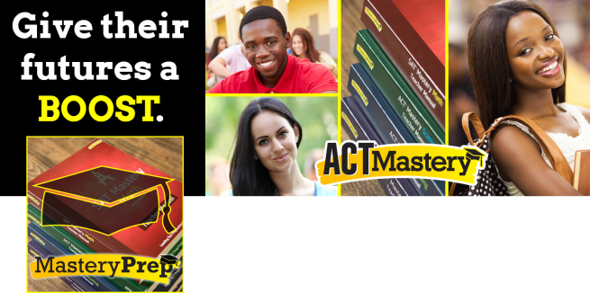
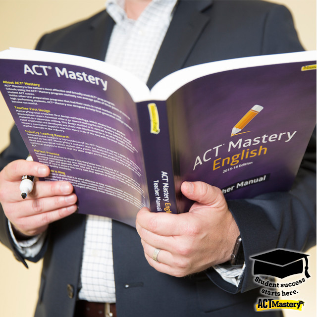
MasteryPrep is an educational technology company based in Baton Rouge, La., but it has representatives and clients dispersed throughout the United States. While MasteryPrep offers a variety of educational products and services, the company’s flagship product is ACT Mastery, a comprehensive educational program designed to increase the ACT scores of high school students. Because MasteryPrep does not offer individual sale retail products, MasteryPrep’s target audience includes school principals, superintendents, curriculum specialists, and other educational administrators who are interested in helping their students succeed. I’ve only been working at MasteryPrep for about two months, but in those two months I’ve seen the company make some progress in developing a cohesive brand standard. The company’s website just recently underwent a design overhaul, and the results were a significant improvement. Nevertheless the company is still a fledgling startup, and it could benefit greatly from an integrated marketing campaign. According to this article, the creative consistency provided by an integrated marketing campaign can greatly reinforce the campaign’s message by increasing the number of times the audience hears or sees the same message. As a former high school teacher, I can greatly appreciate the products my company is developing. By far the most attractive attribute of the ACT Mastery program is its teacher friendliness. The program is extremely detailed, skillfully scripted, and it provides nearly everything a teacher needs to run an ACT prep course at the high school level. In today’s society teachers are extremely overworked, underpaid, and under appreciated. The ACT Mastery program gives teachers breath of fresh air by taking much of the hassle and guesswork out of test preparation. My target audience for this campaign will be teachers, and in my message, I will encourage this audience to pressure school administrators to adopt the ACT Mastery program.

Banner Ads Design

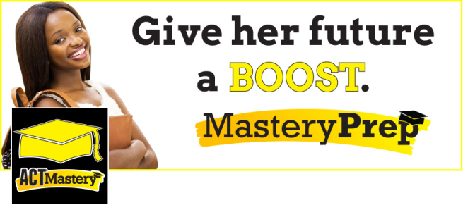
Leaderboard Banner Ad (728 X 90)
Enchanced Leaderboard Banner Ad GIF (784 X 307)
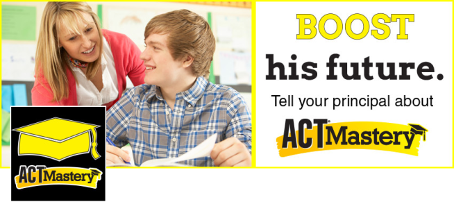
Enhanced Leaderboard Banner Ad (784 X 307)

Click here to view the animated version of the banner ad above.

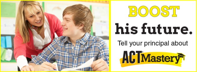
Cube Banner Ad (300 X 250)
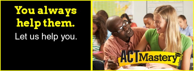
Button Banner Ad (320 X 75)

Social Media

Facebook Cover Photo #1 (851 X 315)
Facebook Cover #1 With Profile Pic
Facebook Cover Photo #2 (851 X 315)
Facebook Cover #2 With Profile Pic
Facebook Cover Photo #3 (851 X 315)
Facebook Cover #3 With Profile Pic
Twitter Cover Photo (1500 X 500)
Twitter Cover With Profile Pic
Instagram Overlay (128 X 128)
Instagram Photo With Overlay (640 X 640)
Facebook Profile Photo (180 X 180)
Facebook Profile Photo (180 X 180) – This is my miscellaneous graphic #1.
Facebook Profile Photo (180 X 180)
Facebook Profile Photo (180 X 180) – This is my miscellaneous graphic #2.

E-mail Design

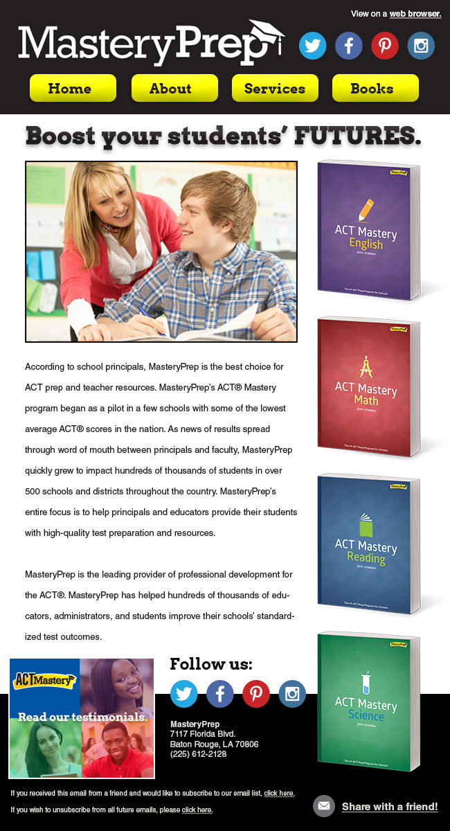
Dedicated E-mail (650 wide)

Wireframe

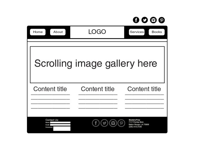
Wireframe (1280 X 972)

Web Page

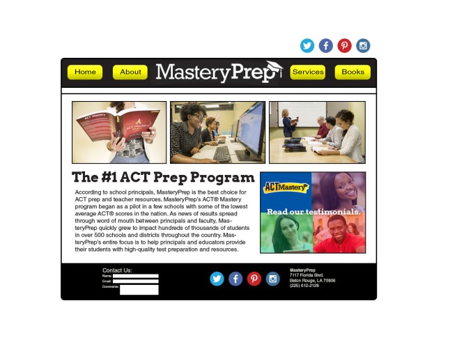
Web Page Design (1280 X 972)

Summary

In addition to these IMC pieces, MasteryPrep could greatly benefit from a few more pieces that would follow the same design strategy (for example: brochures for schools and school districts, PowerPoint presentations for the sales team, a mobile-optimized website and/or mobile app, etc.). Throughout my design process I made an effort to keep some of MasteryPrep’s existing brand standards (logo, color scheme, fonts, etc.), while pulling everything together with a consistent message and audience focus. Overall I think this campaign is very effective, and I look forward to presenting it to our marketing department.
Halloween card with lighting effects

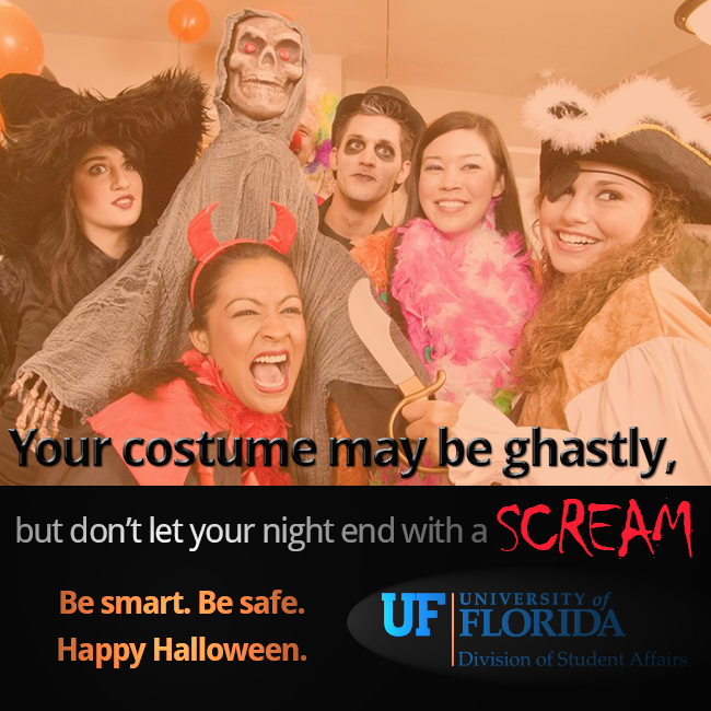
For our final homework assignment in VIC5325, we were asked to create a holiday e-card and to use two lighting effects in Photoshop. I decided to choose a Halloween theme for my e-card because Halloween is one of my favorite holidays.

I decided to make the e-card double as a public service announcement from the UF Division of Student Affairs. During the Halloween season there are a lot of costume parties where excessive amounts of alcohol are served, so I thought it would be useful to send out a message encouraging safe partying. I came up with the slogan, “Your costume may be ghastly, but don’t let your night end with a SCREAM.” I was pretty proud of that slogan. I think it works well for what I am trying to say in this message. To better emphasize my point, I used the Halloween-themed font “Chiller” for the word SCREAM, and I also turned it a blood red color to make it stand out.

For my lighting effects I used a point light over the secondary slogan, “Be smart. Be safe. Happy Halloween” to make it glow a bit. Then I used a spotlight on the UF Division of Student Affairs logo to emphasize the organization who is sponsoring the message.

Here is the final version of my holiday e-card:

Halloween e-card
Halloween e-card

Working with infographics

Note: I am in no way affiliated with Fox News. The article Fun Cheese Facts for National Cheese Day was used to create this infographic, but it was created for educational purposes only.

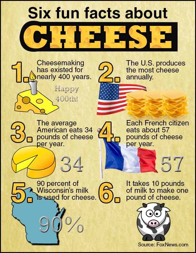
This week I created an infographic containing fun facts about cheese. I’ve been a bit under the weather health wise, so I was a bit delirious when I was created it. I think it came out OK, but I would have liked to come up with a more scientific system to indicate numbers and quantities. Because I chose the more lighthearted of the two subjects, I think it was OK that my design was a bit informal. Here’s my final infographic:

Six fun facts about cheese.

The first thing I did was create my title and numbers by using a clipping mask to place the cheese background inside the number and letter shapes. I think this worked very well, and I believe this is my strongest element. Next I settled on a parchment-looking texture for my background because sometimes when you buy cheese at the deli it comes wrapped in parchment paper. I decided the parchment texture would go well with the cheese theme.

I’ve been ill lately and running on fumes, so I honestly didn’t look up a lot of infographics for inspiration. I did go back and look at the PowerPoint provided in class to see the examples contained there. I did create a rough sketch of my layout on a piece of paper before designing, but I wouldn’t call it a full-fledged wireframe.

After creating the title and numbers, I chose six of the most interesting facts from the article, and I found corresponding clip art that would depict those facts. I inserted these graphics, and I called it a night. I’m mostly happy with it, but like I said, I could have gotten a little bit more elaborate in my iconography/the way the data is depicted.

For this assignment we were asked to use the pen tool in some way. I have trouble with the pen tool because I don’t have a very steady hand. I haven’t gotten to the level of creating extremely complex shapes with the pen tool, so I decided to use it to create a pretty simple shape. I used the pen tool to create the curved background behind the word “cheese” in the title.

Social Media Images – A Tribute to Lafayette, La.

Note: This post was made for educational purposes only. I am not affiliated with Lafayette Travel.

Words can’t adequately describe how shocked and horrified I was this past week over the Lafayette, La., movie theater shooting. Although I currently live in Baton Rouge, La., (which is about an hour’s drive east of Lafayette), I lived in Lafayette between 2006-2007 and again in 2011, and I still have many friends and acquaintances who live there. Of all the cities where I’ve lived, Lafayette is by far my favorite, and it was completely unthinkable that something like that would happen there. Although I didn’t know the victims personally, I do know people who knew them.

When we were asked to choose a travel industry brand for this week’s assignment, at first I thought about doing something obvious like Travelocity or Orbitz. But then I realized I could create my own little tribute to Lafayette, La., by making it the subject of my social media image campaigns. Lafayette is an amazing city with friendly people and incredible food and culture, so I attempted to encapsulate this within my images.

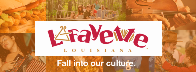
I began my design process by downloading the official Lafayette tourism logo from  the Lafayette Travel website. Here is what the logo looks like:

Lafayette Travel logo

It was kind of a challenge to use this logo because there was no version with a transparent background. I used the magic wand tool to cut out the logo, but of course it didn’t work perfectly. On the back end I did have to do some tedious clean up of stray while pixels.

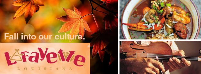
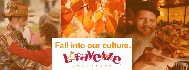
After I cut out the logo, I searched online for images that represent Lafayette culture and cuisine. I combined these images with images of fall leaves to create autumn-themed photo collages. I played around with layer masks and opacity levels to give some of my photo collage backgrounds an orange hue. Here are the images I came up with:

Twitter cover image 1
Instagram watermark
Instagram watermark
Facebook cover image 1
Facebook cover image 2
Facebook cover image 3

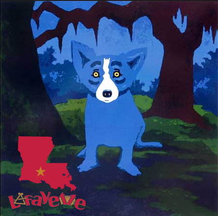
If I were designing a Facebook profile image for this campaign, I would probably use the outline of the state of Louisiana with a star on it similar to what I used in my Instagram watermark. I would choose this because right now a marked map of Louisiana is a popular image on social media due to the recent tragedy.

For a Facebook ad, I would probably pick one specific industry (likely food) and focus on that aspect of Lafayette tourism. I would likely use a strong image of a seafood dish as Lafayette is well known for its seafood restaurants.

I think Pinterest would be a good social media channel for Lafayette tourism because the Lafayette Travel website includes a list of recipes. These recipe photos would work well on Pinterest. Also, I think these images could easily be adapted for use in Google Plus. Because Lafayette Travel links to many local restaurants, Google Plus would be a good place for this content. The restaurants would reap the SEO benefits from having Google Plus profiles.

In each of my images I used the Lafayette tourism logo, and I also incorporated a fall theme in some way. I also repeated the slogan, “Fall into our culture” to help solidify a fall-themed campaign.

Finally, here is my Instagram watermark in action over a painting of the Blue Dog by George Rodrigue, a famous artist who lived in the Lafayette area.

blue dog
blue dog

Creating an email blast!

Note: I created an email blast for a fictional company this week. This marketing message was created for fictional purposes only, and there is no such company as Fair Ware Equipment Rental Services, LLC.

I had a lot of fun with this week’s assignment, and I am excited about the way it turned out. I think it is one of my strongest pieces this semester.

This week we were asked to create an email blast for the same company we created banner ads for last week. Unfortunately, after working a ridiculous amount of overtime last week, my incoherent, exhausted self forgot to upload last week’s files to Dropbox, and I left town without them. Without access to last week’s campaign files, I was faced with two options — cut a much-needed visit with my boyfriend short or create a new campaign for a different fictional company. I decided to go with option two.

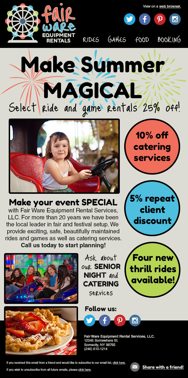
This time I created the fictional brand Fair Ware Equipment Rental Services, LLC., a company that rents out carnival rides and games. I created a brand new logo, color scheme and font scheme for this company, and then I began creating my email blast. I looked at many examples of email blasts for inspiration, and I sketched out my intended layout on a notepad before I started designing.

As usual I used GraphicRiver and PhotoDune for my stock graphics and photography.

The hardest part of this assignment was deciding how to fit in all the required elements in a logical, eye-pleasing layout. I tried to include as much information as possible without making it look too busy.

Here is the final product:

Fair Ware email blast

Designing Banner Ads

Note: These banner ads were designed for educational purposes only. There is no such company as Pyrphoros Mobile Technologies, as it is a fictional brand I created for my design portfolio.

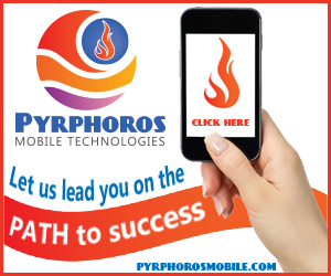
This week we were asked to design banner ads of various shapes and sizes, and we were also asked to create an animated GIF of one of our banner ads. For this assignment I decided to expand on a project I completed last semester in VIC5315, Prof. Ramsey’s brand identity class. In that class I created a brand identity for a fictional company, Pyrphoros Mobile Technologies, a digital design firm specializing in mobile application development. I decided to use this brand identity for my banner ads as I thought having more brand identity pieces for the same company would be a good portfolio builder.

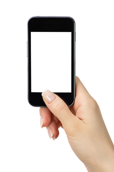
For each of my ads I have several repeated elements including the logo, the blue-orange color scheme, and an image of a female hand holding a mobile phone. I borrowed this idea from our Thursday class. I liked the idea of using a blank phone or tablet screen to show content, so I purchased two stock images from PhotoDune to use in my banner ads. Luckily I only needed low resolution images for my banner ads, so the images were only $1 each! Here are the images I purchased to help me get started:

Hand holding mobile smart phone with blank screen

I decided to start designing the leaderboard banner ad first.  I am mostly happy with it, but I had a little bit of trouble achieving the look I was going for. The main issue is that I couldn’t figure out how to use “type on a path” in Photoshop. Last semester we learned that technique in the Illustrator class, and I was trying to achieve the same thing in Photoshop. I needed “type on a path” so I could achieve the curved type inside the curvy flag I created in Illustrator. Because I couldn’t figure out how to do it, I imported the type as pixels from Illustrator, but this didn’t give me much flexibility to manipulate it once I placed it. I used the pen tool in Illustrator to create my path, but I didn’t quite get the curving perfect. The pen tool is difficult to work with, and I still need a little bit more practice. In the future I plan to tweak this a little bit for my portfolio. After working a ridiculous number of overtime hours this week, I’m glad I was able to create something at least halfway decent looking, but I know it could have been better had I been better rested this weekend.

Pyrphoros Leaderboard Ad

After designing the first banner ad, the rest of the designs simply fell into place. I tried to repeat as many elements from the first ad as possible, but of course I had to take into account the different shapes and sizes. Luckily I had already designed both horizontal and vertical versions of my logo, so that part was already done. Beyond that the main thing I had to consider was how to effectively reuse design elements from first ad while achieving a different layout to accommodate the new canvas shapes and sizes. Here are the rest of my ads:

Pyrphoros Rectangle Ad
Pyrphoros Skyscraper Ad
Pyrphoros Button Ad
Pyrphoros Button Ad

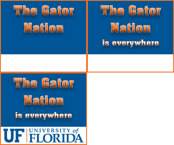
The last step in my design process was creating an animated GIF from one of the ads. I decided my skyscraper design would work best for the animated GIF. I repeated the concept I used from the University of Florida banner ad I created for class the other day.

Gator Banner Ad
Gator Banner Ad

Similar to the Gator ad, my skyscraper GIF features blinking text. I decided to emphasize the “click here” portion of the ad by having it blink more rapidly than the rest of the text. Here is my animated GIF:

Skyscraper Ad Animated

Overall I’m happy with my banner ads, and I believe this was a valuable exercise in ad design. However, my schedule has me stretched very thin right now, so I am looking forward to tweaking these pieces in the future to make them a bit more refined.

Restaurant Wireframing

Note: This design project was completed for educational purposes only. I am not in any way affiliated with Fusion Cafe.

For our eighth design assignment in VIC5325, we were asked to create a wireframe for our favorite restaurant’s homepage. One of my favorite restaurants is Fusion Cafe in Metairie, LA. It just so happens that this restaurant has an expired domain (oops!), so obviously it needs some major help in the website department!

Fusion Cafe serves an interesting mix of cuisine including Vietnamese, Sushi, and even New Orleans style fried seafood. I’m slightly obsessed with Vietnamese food, so I pretty much always order either pho or banh mi. Although Fusion Cafe’s website is not currently working, you can check out its Yelp page here.

For my wireframe I decided to design an image heavy splash page. I prefer to design websites that have eye catching, creative splash pages, and I like to save most the body text for the inside pages. For my wireframe, the most prominent objects on the splash page are the restaurant’s logo and the scrolling image gallery. These are important because they would draw the viewer in with the brand identity and the photos of yummy looking food. A secondary feature is clickable image panels leading to an event schedule, a recipe page, and a contact page. I think an image heavy, text light design is appropriate for a restaurant splash page because people are attracted to images of food. I would like to include as many enticing images on my splash page as possible without over complicating the design.

For my color scheme I chose to use black, light green, bright green and orange. As I recall there are orange accents in the restaurant’s interior decor, and I chose shades of green to complement the orange.

I also think these colors are appropriate because some of my favorite Vietnamese dishes such as banh mi (Vietnamese po-boy) and bun thit nuong (vermicelli noodle bowl with chargrilled pork) include cucumbers (light green), jalapenos and fresh herbs (bright green), and carrots (orange).

color-scheme

Vietnamese po-boy
See the marvelous colors in this delicious looking Vietnamese po-boy?

I’m always instantly attracted to the colorful herbs and veggies found in Vietnamese cuisine, so I conclude that a color scheme reminiscent of fresh herbs and veggies will attract attention to my site.

Here is my final wireframe:

Wireframe for Fusion Cafe splash page

Creating a Mood Board!

This week I was asked to create a mood board for a brand of my choice. I decided to continue working on the coffee house brand I established with the chalkboard project a few weeks back. I was a little bit too pleased with myself for coming up with such a clever name for a coffee shop (Espressoself), so I thought it would be neat to create a mood board for this fictional business I’ve been daydreaming about.

Part of the assignment was choosing three recent Pantone colors of the year. The three colors I chose were Radiant Orchid (2014), Emerald (2013), and Honeysuckle (2011). I chose these colors because collectively they create a bright and cheery vibe for my lovely little coffee shop. Purple is my favorite color EVER, so I chose to use the Radiant Orchid for my coffee shop’s logo. I kept the same typography scheme for this iteration of the logo, but I added a rectangular panel beneath the business name, and I didn’t use the coffee cup “wingding” this time because I knew I’d be placing an actual photo of a coffee cup in my mood board, and I didn’t want to be redundant.

I needed to use the other two Pantone colors somehow, so I chose to make the background color Emerald, and I used Honeysuckle for background shapes beneath my photos. I created a 3D effect for my photos and shapes by using the blending options bevel and emboss, stroke and drop shadow. I was pleased with this effect as it makes my photos stand out against the background.

I chose royalty free images that depict various aspects of my imaginary business. I imagine Espressoself to be a friendly little place where one could enjoy an excellent cup of coffee, a healthy and tasty meal, and sometimes live music. I would want it to be a fun place to meet up with friends and hang out. Happy and friendly was mood I was going for in my mood board, so I chose images of delicious-looking food and beverages, and I chose a bright and cheery color scheme.

The last thing I did before publishing my image was to add a watermark in the bottom right corner. I conveniently used an action I had previously created to apply this watermark. The action created the watermark for me, and all I had to do was reposition and resize it. How convenient!

Here is the final image:

Espressoself mood board

Notes:
Images were sourced from Google Image search with a search filter set for “labeled for reuse.”
The Pantone colors I used were:
1. Radiant Orchid (CMYK: 29, 69, 0, 0; RGB: 181, 101, 167)
2. Emerald (CMYK: 99, 0, 69, 0; RGB: 0, 155, 119)
3. Honeysuckle (CMYK: 0, 86, 16, 0; RGB: 203, 101, 134 )

Logos in Photoshop

For our project this week we were asked to design a logo in Photoshop. I had a lot of trouble with this because I kept wanting to reach for tools in Illustrator that Photoshop just doesn’t have. I much prefer designing logos in Illustrator, but some extra Photoshop practice is always welcome.

We were given 50 logo marks to work with, and I chose to combine elements from two of them. The hypothetical company I designed my logo for is a company that deals in green initiatives. Because of this I decided to use bright colors found in nature. I also chose a neat font for my tagline that looks a bit like sticks placed next to one another. My process consisted of copying the logo mark pieces from Illustrator, changing their colors via the paint bucket tool, choosing fonts for my company name and tagline, playing with the kerning a bit to polish the typography, and then creating alternative versions of the logo, grayscale and reverse.

I am happy with the full color version, but I’m not sure about the reverse or grayscaled versions of the logo. I’m not sure if it looks as nice in those alternative configurations. I would like to play around with this a bit more to see if I could make it more versatile. I believe the logo would work fairly well with a transparent background, although in that case, I may want to place a white circle behind the logo mark itself to preserve the white curvy lines within.

The purpose of the logo is to attract local business partners to contribute to green initiatives, and I do believe my company name and logo would serve this target audience. With a professional-looking logo my company would now be able to create an integrated marketing strategy with consistent typography, color schemes, taglines, etc. However, if the company administrators decide that the tagline needs some work, my design would accommodate alternative taglines as long as they aren’t too long.

Here are the final versions of my logo:

Color version.
Color version.
Grayscale version.
Grayscale version.
Reverse version.
Reverse version.

Gemvara Web Ad

Note: I designed this web ad for Gemvara as part of a graduate school assignment. I am not affiliated with the company Gemvara in any way, and this design was created for educational purposes only.

For week five in VIC5325 we were assigned to create a marketing piece for a brand that we like and identify with. Because I have been scouring the Internet for the perfect engagement ring lately (crossing my fingers the proposal happens soon!), I’ve become very familiar with the online jewelry retailer Gemvara. I decided to use the Gemvara brand for this assignment.

To provide context, here are some screenshots of some of Gemvara’s marketing pieces.

Gemvara Website.

Screenshot of the Gemvara website

Gemvara Facebook
Screenshot of Gemvara’s Facebook page
Gemvara Email
Screenshot of a Gemvara email blast

As you can see Gemvara uses a black and white color scheme for most of its marketing designs. My guess is that Gemvara doesn’t want to distract from the colored gem photos that it features prominently on all of its pieces; therefore it chooses not to use much color in its text, logos, borders, etc.

For my web ad, I decided to try to stick with that black and white color scheme with only a small pop of color. Here are the steps that I took to complete my design:

1. First, I decided to focus my web ad on Gemvara’s stone reset campaign. This is something they’ve been marketing heavily lately. Basically how it works is you send in an old piece of jewelry that isn’t quite in style anymore. Gemvara takes out the gemstones and places them into a new, more stylish setting. I used a set of Gemvara’s  “before and after” images for my ad.

2. Then, I downloaded a copy of Gemvara’s logo. The largest one I could find was only medium sized, so I decided not to make it the most dominant element in my design. I didn’t want it to become pixelated if I blew it up too much.

3. Next I looked through Google images to find a nice background image to use in the ad. I found this lovely image, which ended up working perfectly.

Wedding Flowers Background

4. I used the “inspect element” feature in my web browser to look at the website’s CSS, so I could figure out what fonts Gemvara uses in their marketing campaigns. The two major fonts Gemvara uses are Adobe Caslon Pro and Brandon Grotesque. I was able to obtain Adobe Caslon Pro for my design via Adobe Typekit. I found Brandon Grotesque in Typekit, but it was listed as a web only font, so I could not sync it to Photoshop. Because of this, my design only uses one typeface. However, I tried to improvise by using different font weights and italics, so hopefully that provided enough contrast throughout my various pieces of text.

5. I added a black and white adjustment layer to my background image, and I positioned the Gemvara logo in the bottom left corner. I then merged the background and logo layers, so I could apply a texture layer style to both. The texture layer style makes the background image look like a newspaper cutout. It’s a neat effect!

6. I placed the before and after images inside of a clipping mask to make them a circular shape. I also applied a black and white adjustment layer to the before image. That way the only color in the whole image is the after image. The rose gold color of the “after” ring provides a nice pop of color. I then used the eyedropper tool to match the rose gold color, and I placed the text “Stone Reset” in that color.

Here is the final image. I’m pretty happy with it, and I believe it matches Gemvara’s design schemes fairly well.

Broussard_Week5